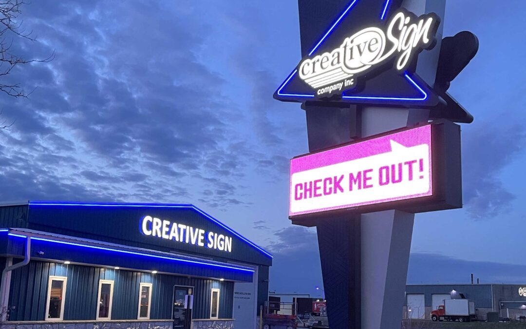
Our exterior got another upgrade this week! A big thanks to everyone that helped make our new pylon sign a reality.
The new asymmetrical design features a two-tone blue pattern achieved by a vinyl wrap applied on three sides of the shroud. The large black arrowhead points to our building and has an outline of blue tube LED. Our logo in white is more readable from the highway.
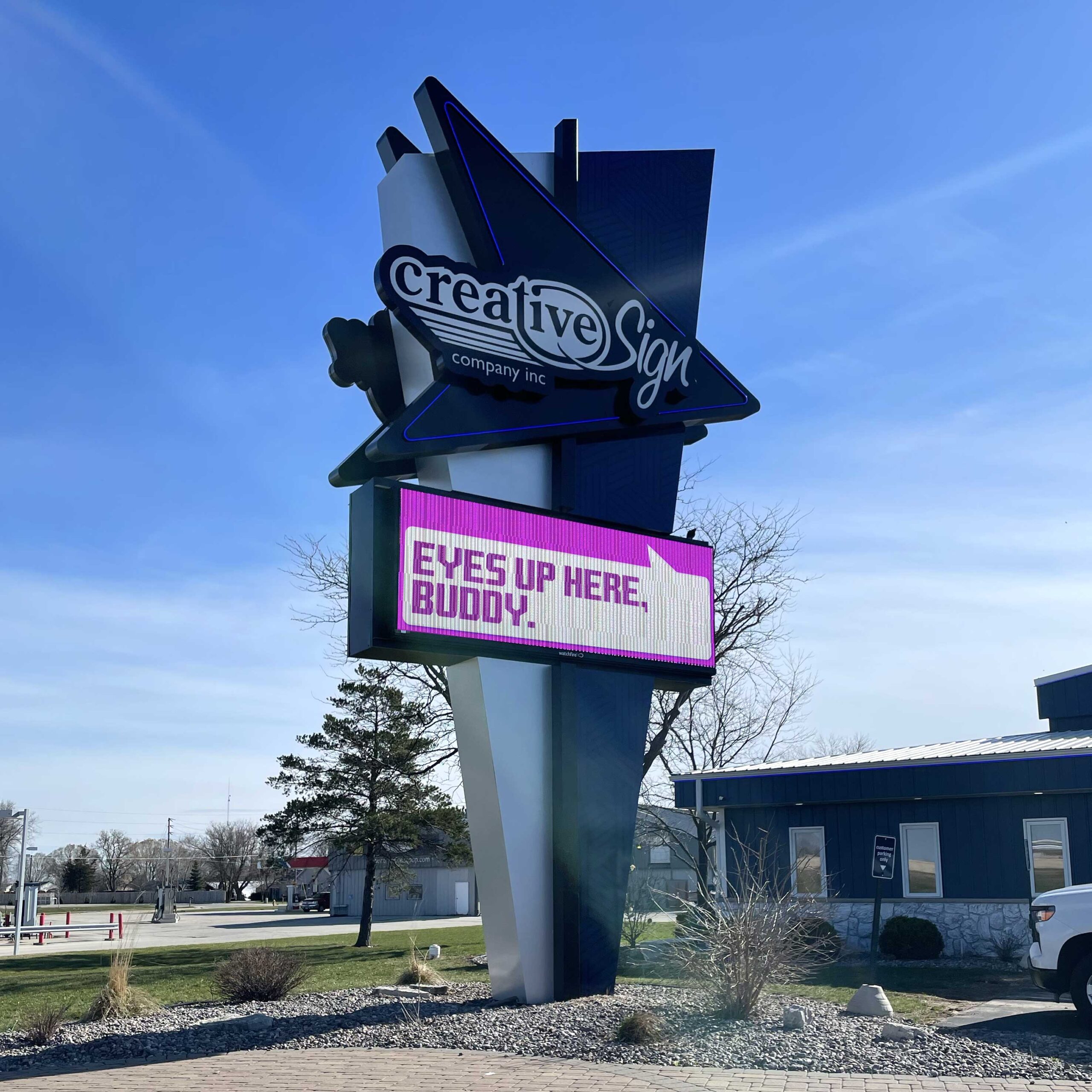
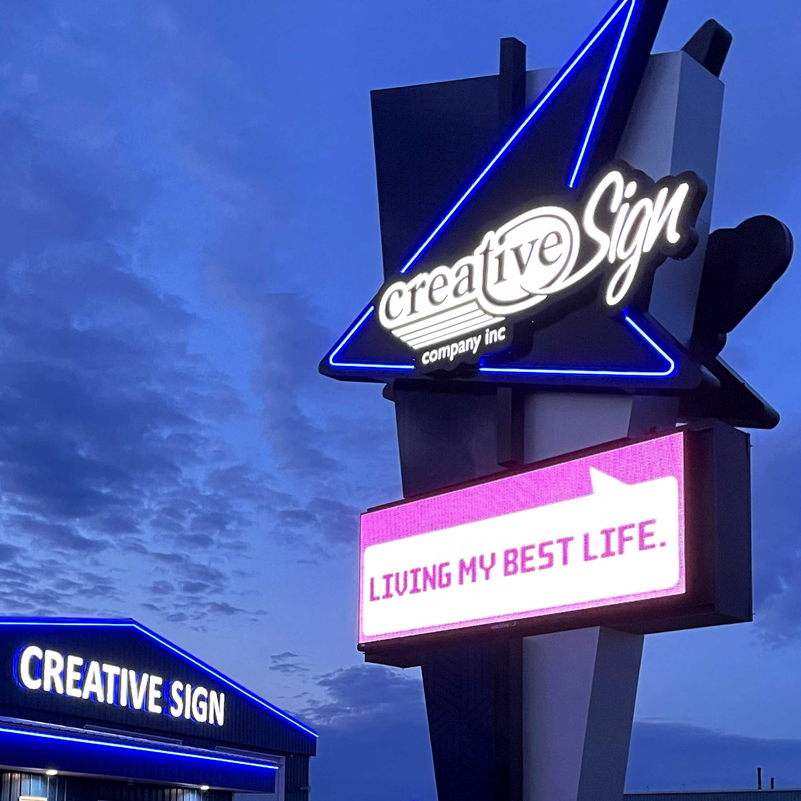
We were able to reuse our existing Watchfire electronic message center (which was still going strong) and the existing pole and foundation. Reusing these elements helped keep costs down and took time off the install timeline.
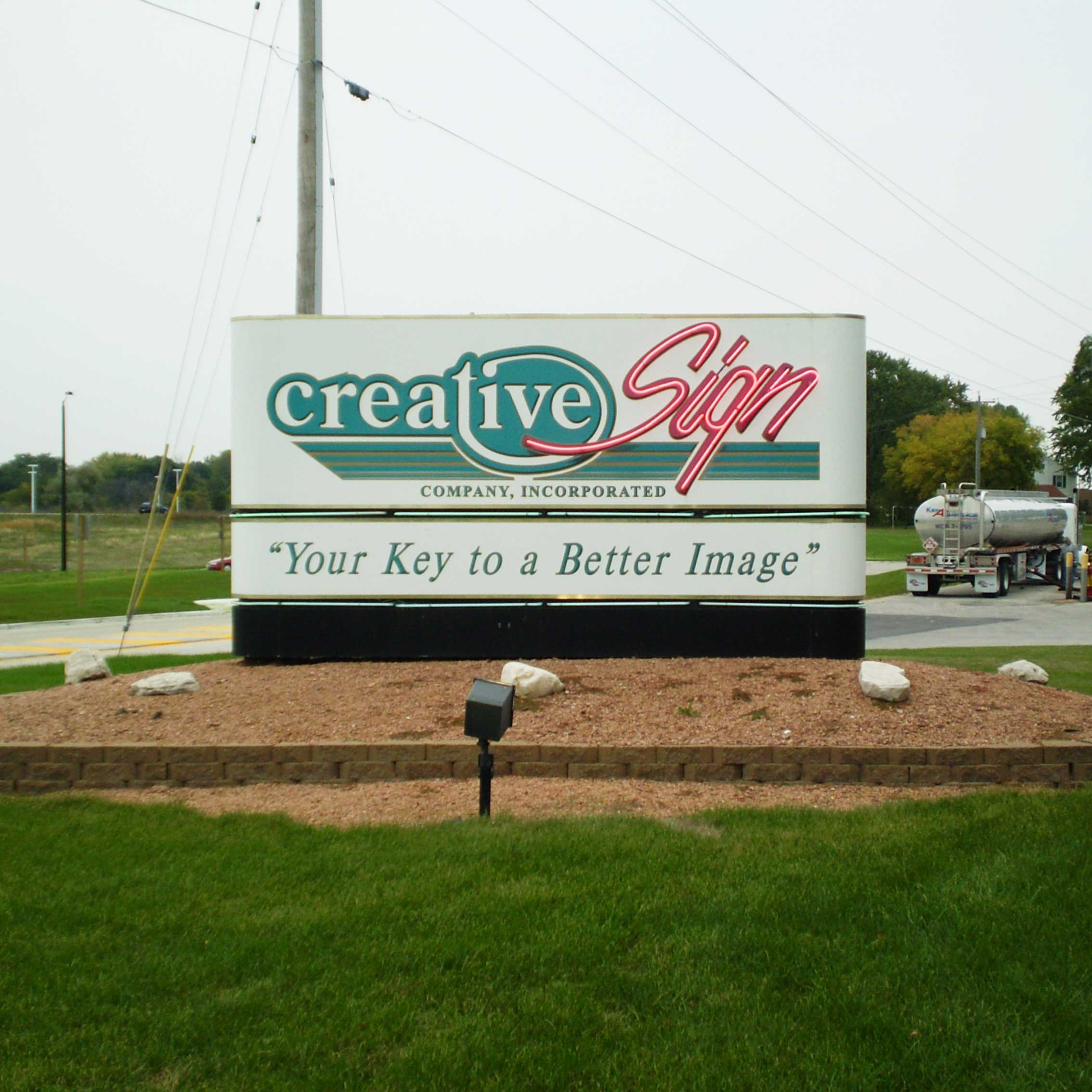
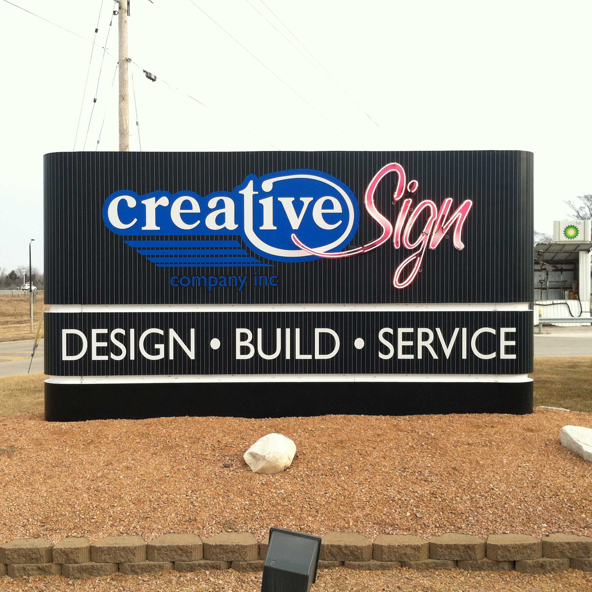
We’ve had several iterations of our freestanding sign over the years. In 2008 and 2012 “Sign” was featured in neon applied directly to our monument, as we offered custom neon signs.
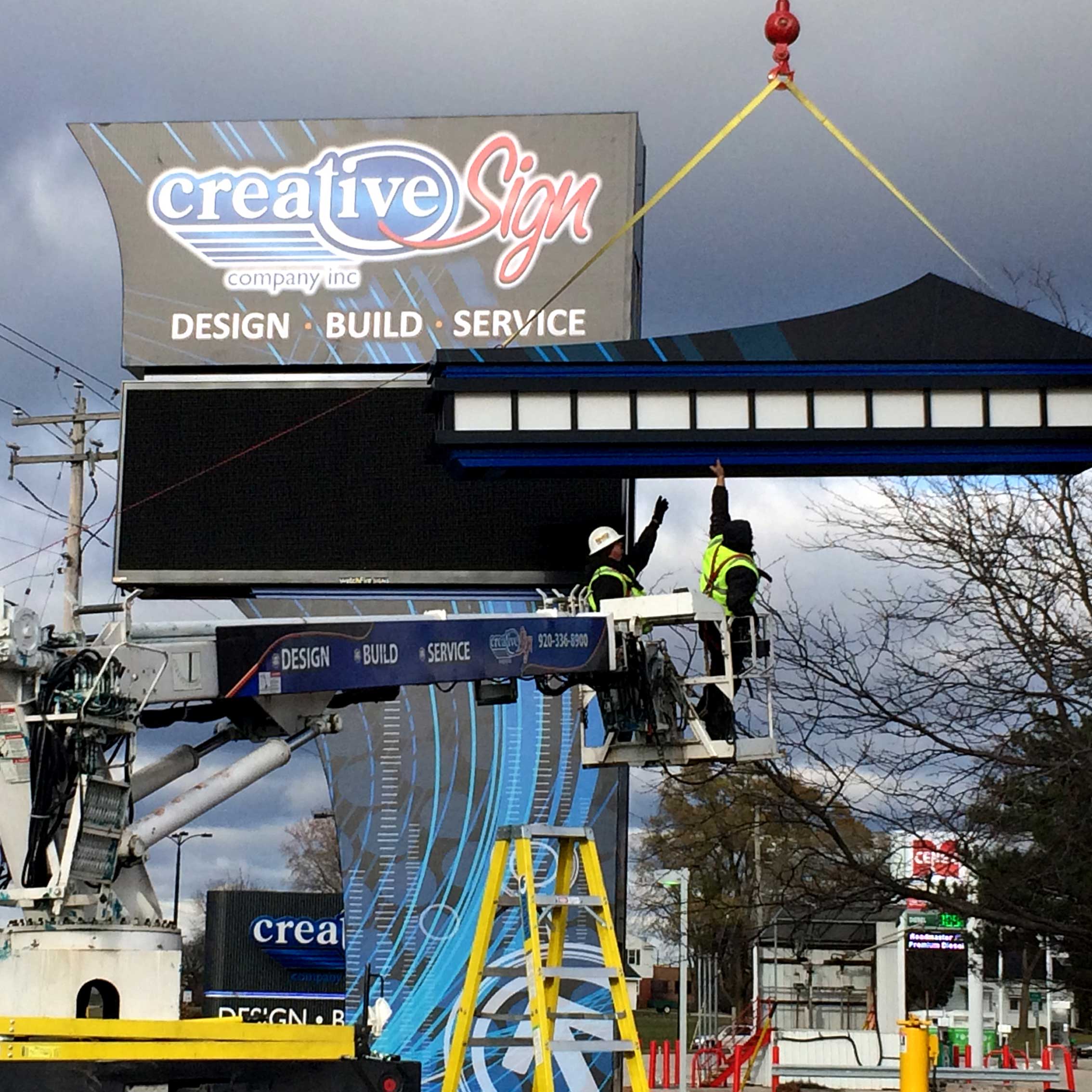
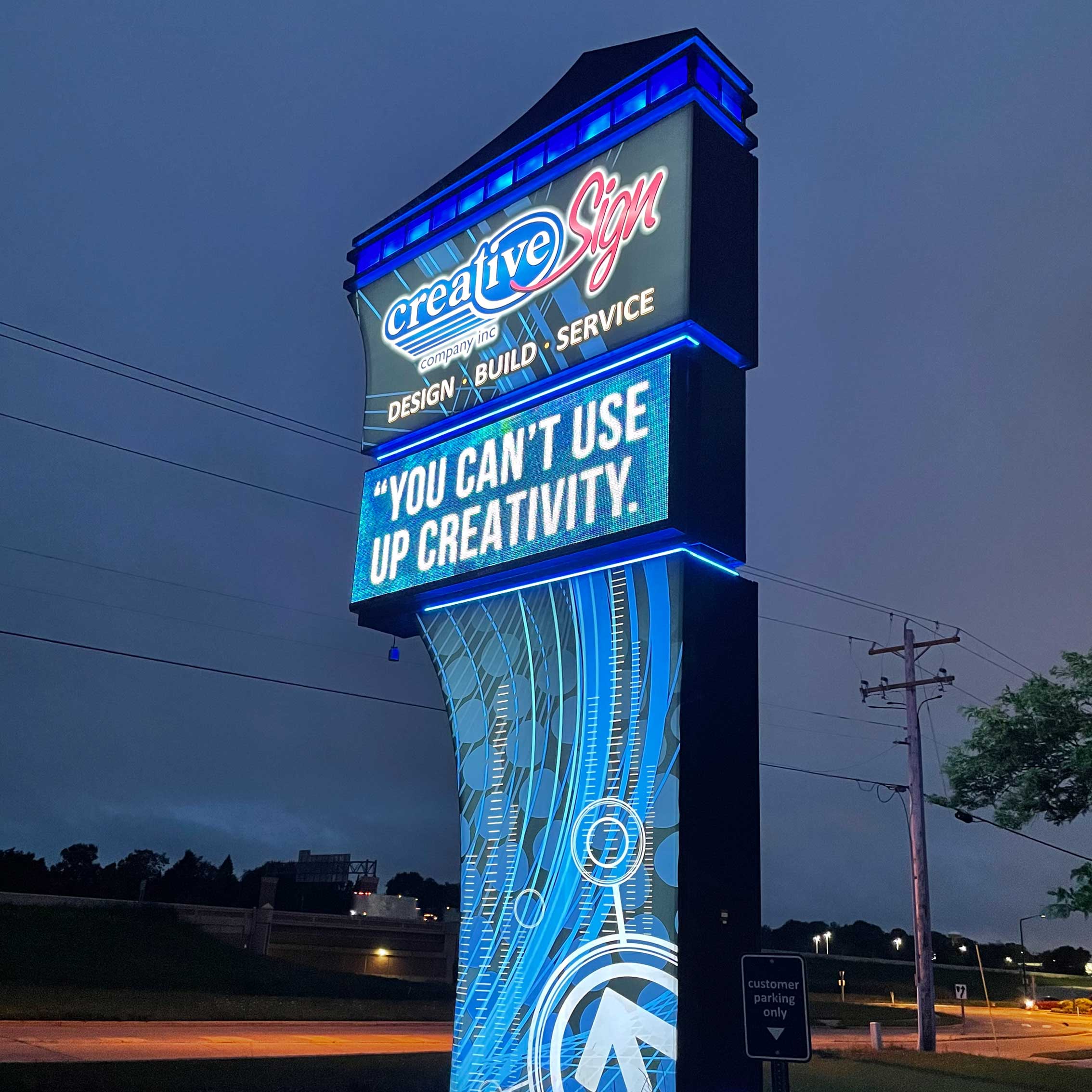
In 2014 we constructed and installed a 35-foot-tall pylon sign to showcase our fabrication capabilities and show off how a dynamic Watchfire EMC can really upgrade a business’ visual impact from the road. Accent lighting and a changeable light feature at the top of the sign attracted attention at night.
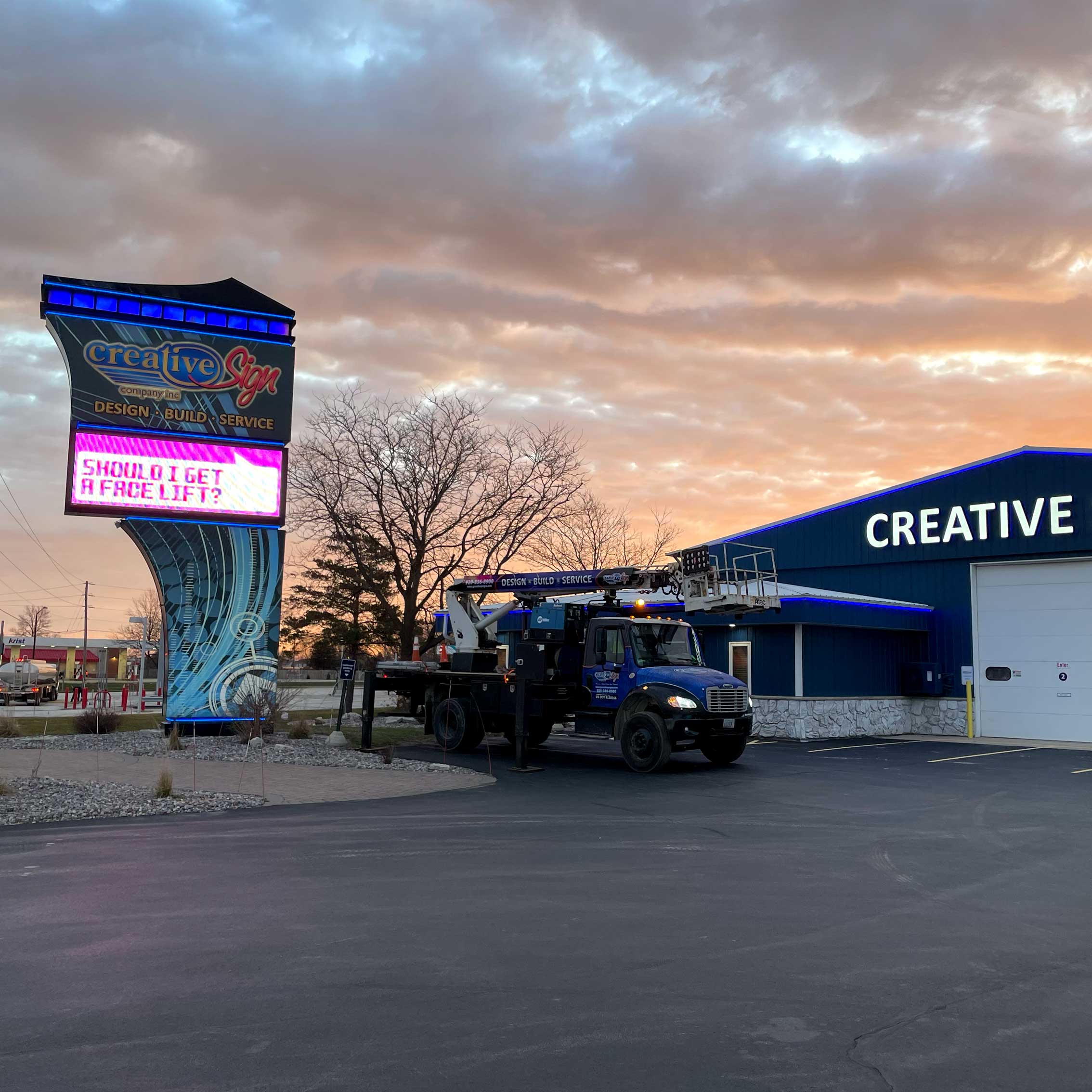
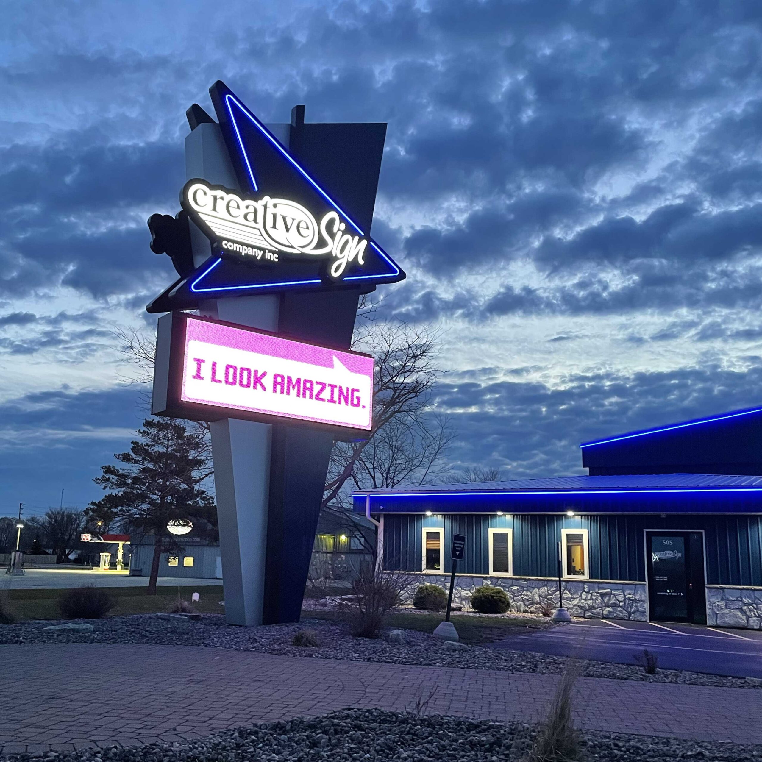
Ten years later we were faced with the choice to either give our current design some TLC with new faces and a new coat of paint… or to revamp the works. We chose the latter. We are a sign company after all.
If you think your business’ signage could use a face lift – or a complete tear down – contact our sign professionals to help determine what could be done to take your image to the next level!
We’ve got tons of examples inside and outside of our building, and we love to give tours! Stop by to see the magic in person.
